all projects

Product Designer · 2023–2024 · Fintech, DEI Analytics

Lenox Park Solutions

Designed data-dense analytics dashboards that help institutional investors track diversity metrics across clients representing $4T+ in combined AUM.

$4T+
Assets under management
3,500+
Registered users
1,800+
Organizations
Faster time-to-insight
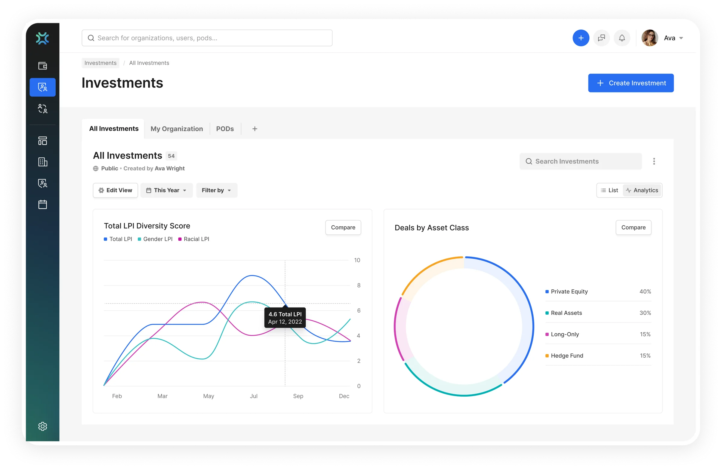
RoundTables investments analytics with LPI diversity trend lines and deals by asset class

Part 1

about lenox park solutions

Lenox Park Solutions (RoundTables) is a fintech platform that helps institutional investors, pension funds, endowments, family offices, track and improve diversity metrics across their investment portfolios. Think of it as the Bloomberg terminal for DEI in finance: complex data, high stakes, specialist users.

The platform is trusted by leading organizations representing $4T+ in combined client assets, including J.P. Morgan, Goldman Sachs, Netflix, and Loom. Users are investment analysts and portfolio managers who make compliance decisions based on dense, multi-dimensional data.

Context & team

My role
Sole Product Designer
Team
Founder + 2 engineers
Challenge
Learn institutional compliance fast while designing for specialists

What I designed

6 core product areas

I redesigned the entire platform, from investment tracking to analytics dashboards to the marketing website.

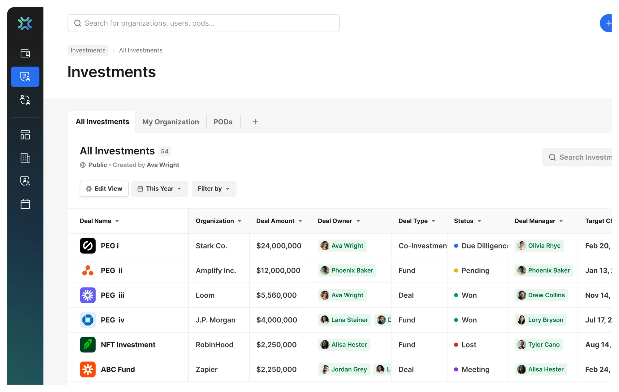
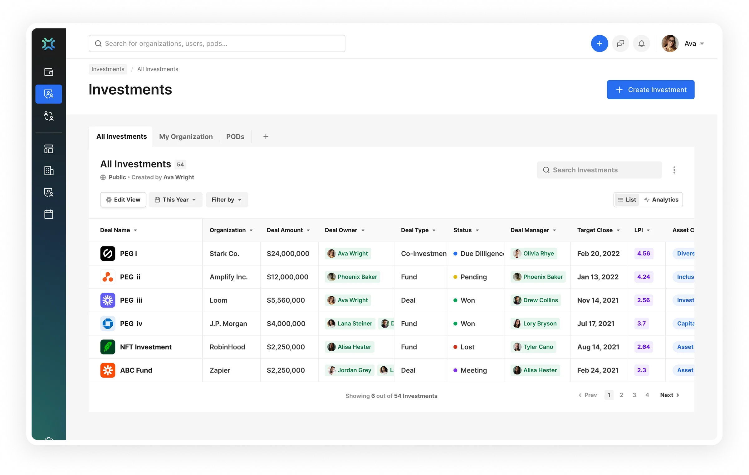
RoundTables investments table with status dots, LPI score chips and deal-owner badges

Investments Overview

Redesigned the deals table with visual status indicators, LPI scoring chips, and role badges, analysts scan 50+ investments and spot action items in seconds.

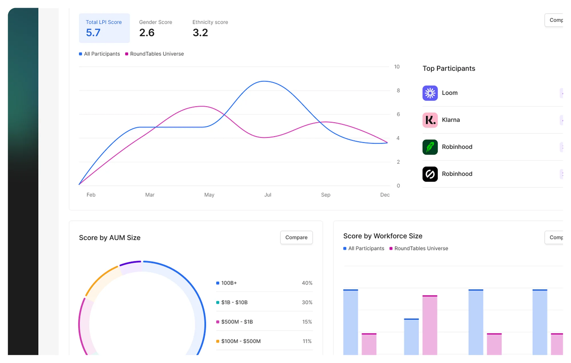
RoundTables analytics dashboard comparing LPI scores by AUM and workforce size

Analytics Dashboard

The LPI (Lenox Park Index) scoring dashboard, diversity trend lines, score breakdowns by AUM size and workforce, and comparative benchmarking. The tool analysts use daily.

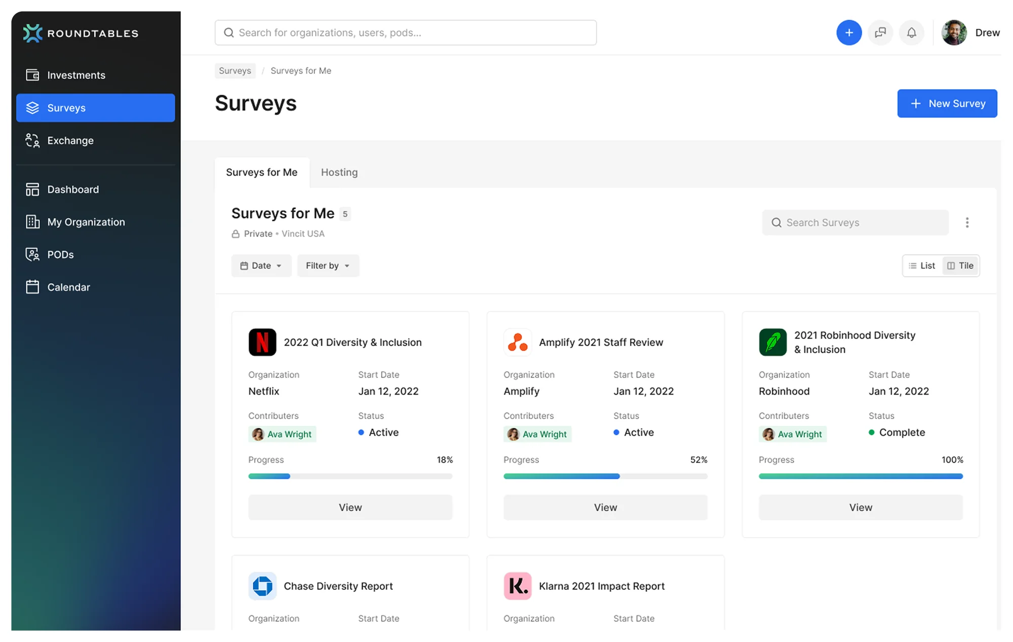
RoundTables diversity survey tracking with progress states across portfolio organizations

Diversity Surveys

Survey collection and tracking across portfolio organizations, progress states, contributors, and status at a glance so analysts know what’s outstanding.

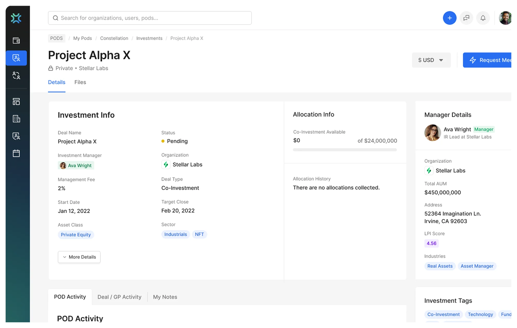
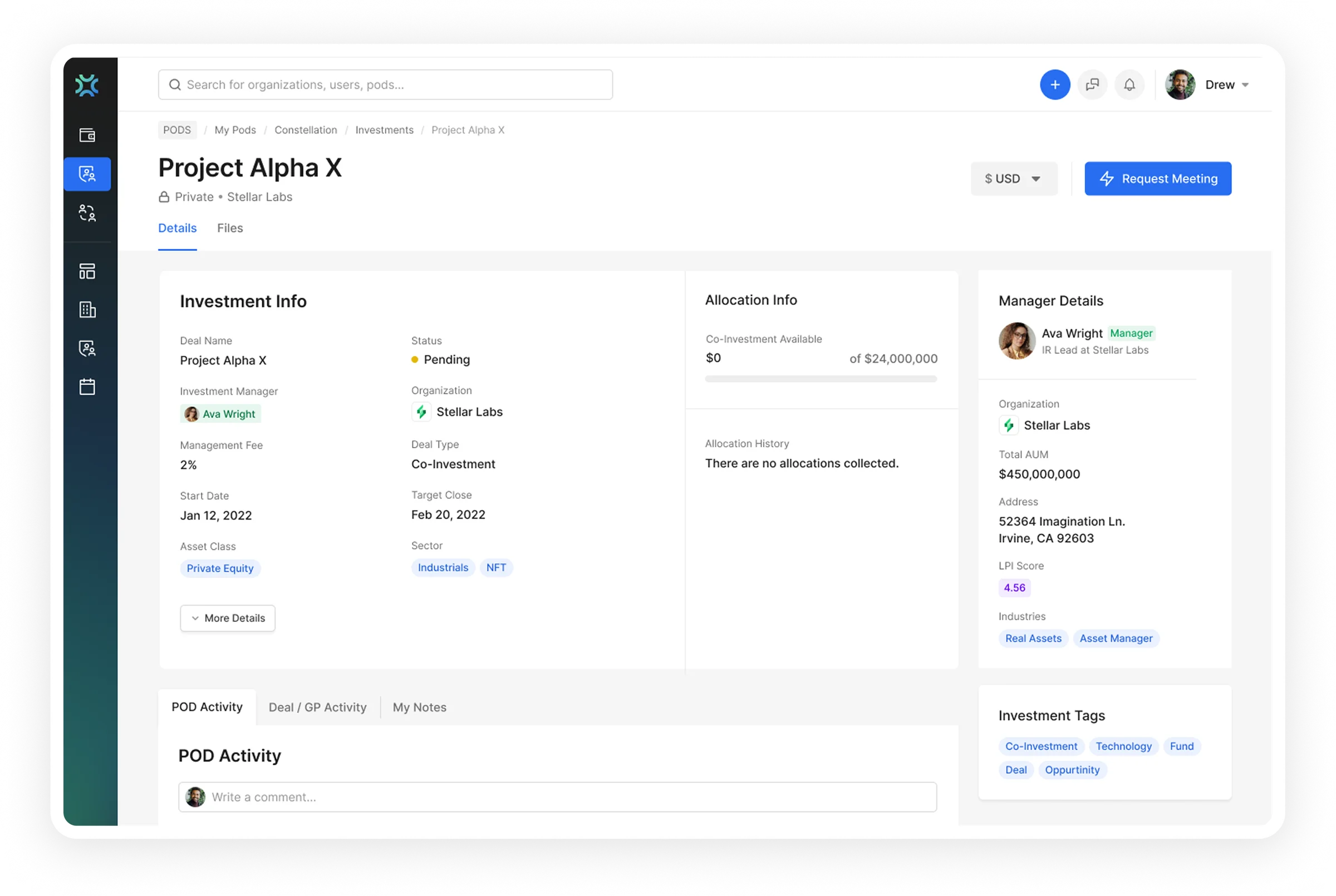
RoundTables investment detail with allocation data, manager details and POD activity feed

Deal Detail & Collaboration

Investment info, allocation data, manager details, and team activity in one view. A POD activity feed enables real-time collaboration without leaving the deal page.

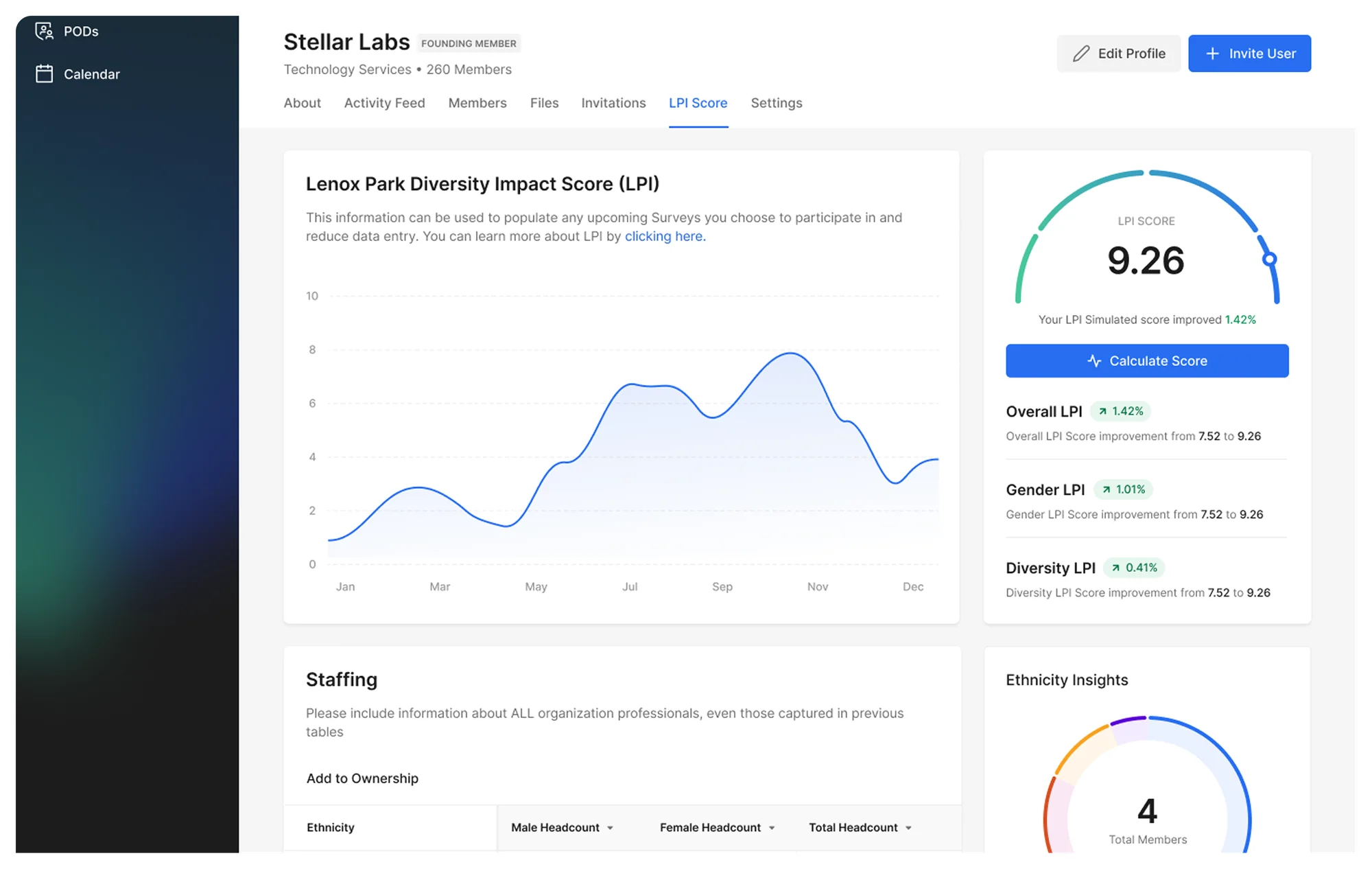
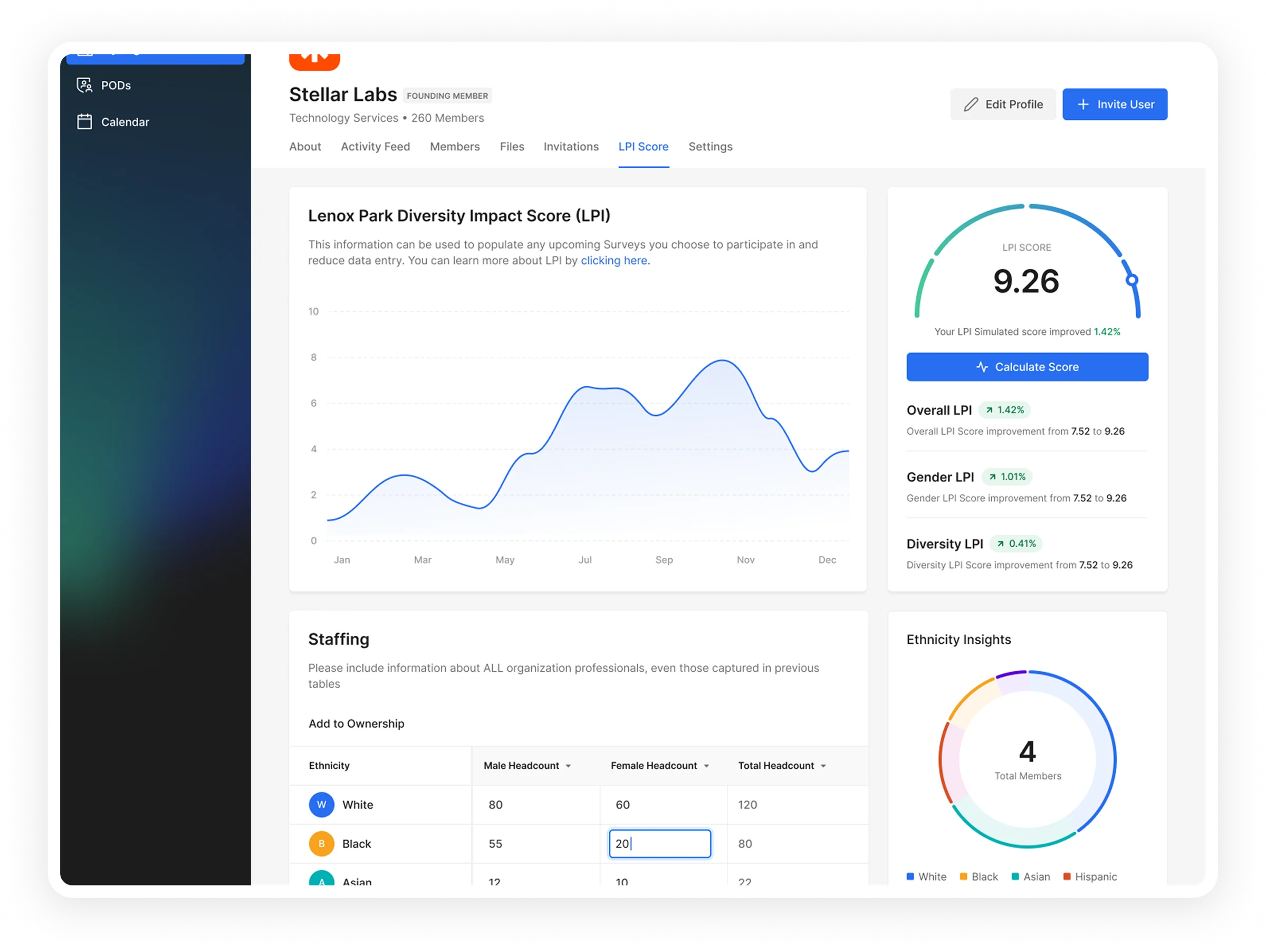
RoundTables organization LPI score with diversity gauge, staffing inputs and ethnicity breakdown

Organization LPI Score

Per-organization diversity-impact scoring with gender and ethnicity breakdowns, simulated improvements, and the staffing inputs that drive the score.

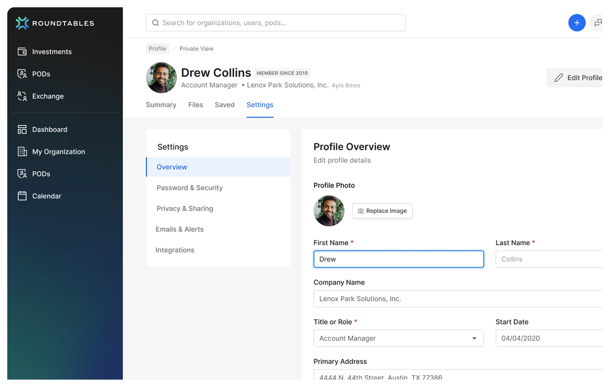
RoundTables member profile and settings with privacy controls

User Profiles & Settings

Member profiles, privacy controls, and organization settings, a settings architecture that scales as the platform adds configuration options.

Part 2, Deep Dive

making complex data actionable

The core challenge wasn’t displaying data, the platform already had plenty. It was making that data actionable. Analysts were drowning in metrics, unable to quickly identify which investments needed attention, which organizations were improving, and where compliance gaps existed.

The problem

Raw data tables weren’t translating into decisions

  • Analysts spent 60% of their time cross-referencing data between views instead of analyzing it.
  • All metrics surfaced at once with no hierarchy, LPI scores, deal amounts, status, managers, and dates all competed equally.
  • Comparing diversity metrics across portfolio companies required exporting to spreadsheets, the tool meant to eliminate spreadsheets was creating more.
RoundTables investment research table showing many competing data dimensions at once

Research

Analysts needed comparison, not deep-dive

  • The primary task was comparison. Analysts rarely looked at one company in isolation, their workflow was always relative: “How does Fund A’s score compare to Fund B?”
  • Even experts experienced overload. These were institutional analysts with decades of experience, and they still struggled with the density. If experts can’t parse it, the UI is wrong.
  • Compliance deadlines created urgency. Quarterly reporting meant answers in hours, not days. Every extra click cost real time under real pressure.

Key decisions & trade-offs

Decision 1

Comparative dashboard layout

Side-by-side views for cross-company DEI metrics. LPI trend lines, donut charts for asset-class distribution, and comparative scoring, all visible without scrolling.

Why this, not the alternativesSingle-company deep-dive views required constant back-and-forth navigation. The comparative layout matched how analysts actually think, always in relative terms, never absolute.

Decision 2

Progressive data density

Summary cards at the top (Total Investments, AUM, Impact-adjusted AUM) with drill-down into table views. Users choose their depth.

Why this, not the alternativesShowing everything upfront caused overload even for experts. Summary-first, detail-on-demand matched the “scan then dive” behavior we observed in every interview.

Decision 3

Visual status system for deals

Color-coded status dots, LPI score chips, and role badges on every row. Analysts can scan 50 deals and find the 3 that need attention in under 10 seconds.

Why this, not the alternativesText-only status labels required reading every row. Visual encoding lets peripheral vision do the filtering, critical when managing 50+ investments under deadline pressure.

RoundTables organization LPI scoring detail with diversity gauge and staffing inputs
RoundTables single deal detail view with allocation, manager and activity panels

Before vs. after

Before
After
Cluttered, overwhelming dashboard layout
Simplified, scannable interface with clear visual hierarchy
Hard-to-scan investment data
Streamlined investment management for faster decisions
Collaboration felt disjointed and secondary
Integrated collaboration for seamless teamwork

Impact & results

Faster time-to-insight
↓60%
Cross-referencing time
$4T+
Combined client AUM
ESG
Full compliance

The comparative layout became the default view. Analysts stopped exporting to spreadsheets for cross-company analysis. Quarterly-reporting prep dropped from days to hours.

Reflection

“Simple” for experts means “well-structured,” not “less information.” The instinct is to hide data to reduce complexity, but institutional analysts need density, they just need it organized. Progressive disclosure with smart defaults gave them the depth they needed without the chaos they had.

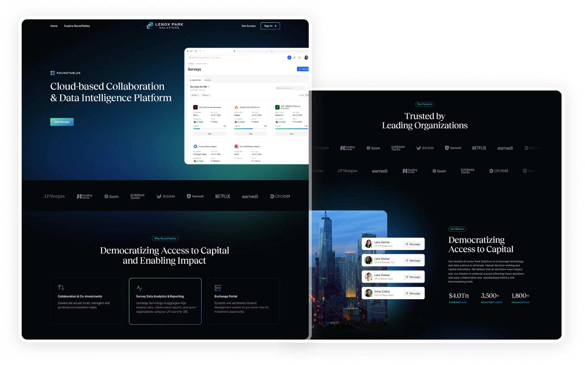
Lenox Park Solutions RoundTables marketing landing page